By: Josiah Huckins - 7/16/2023
minute read
Do you use Home Assistant? Do you like Star Trek? Then you should check out this HA theme!
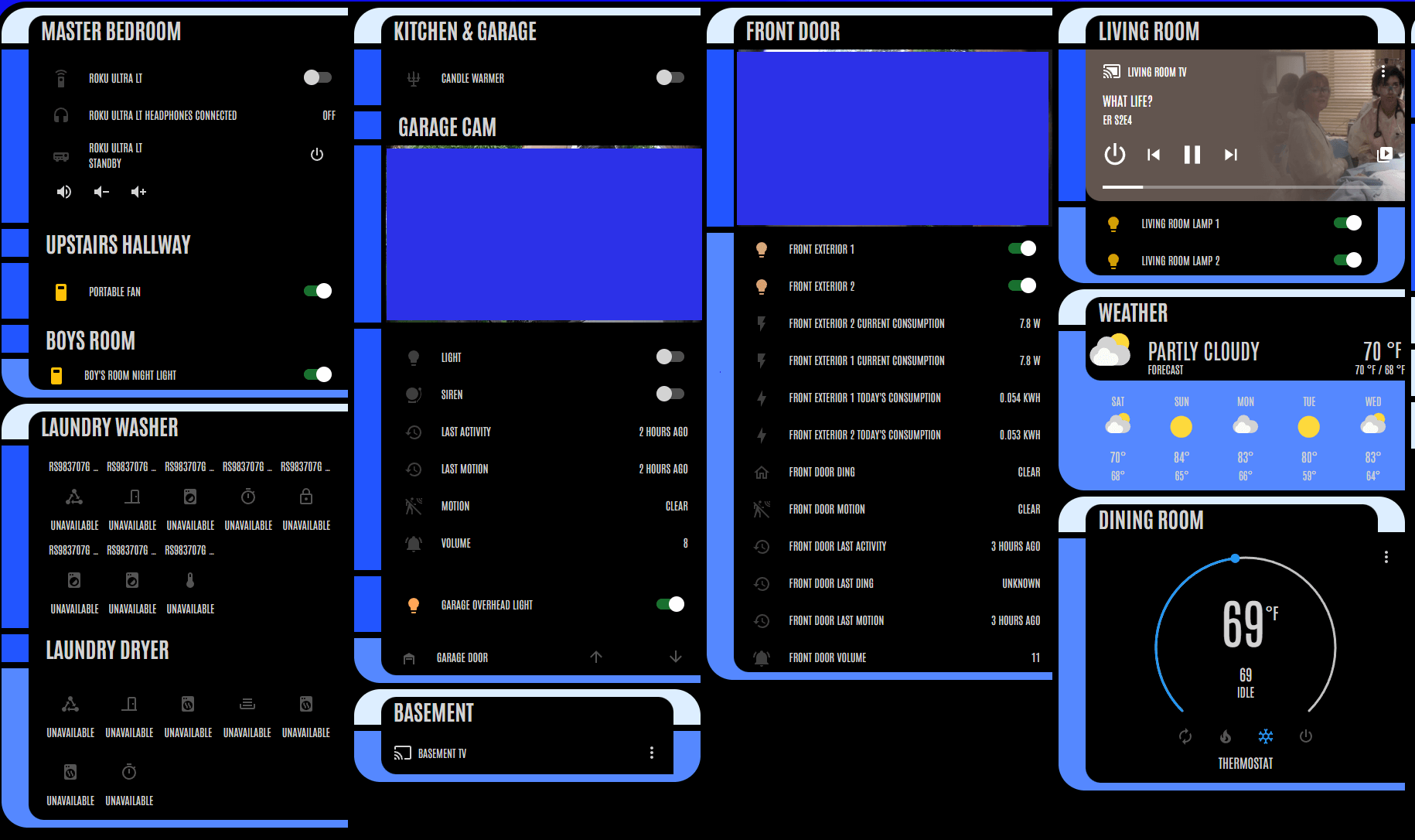
Envisioned and developed by my good friend, this theme allows you to style your dashboards with tiles and buttons that look like they come straight out of an Enterprise D bridge console!Its highly customizable, with a number of button types and style classes to choose from. It also comes with a number of color themes.
I like to switch between a bold "Kronos" orange theme and "Nemesis Blue" (as featured below):

I'm not the best interface designer, but the potential to make a great looking dashboard is there. I envision a touchscreen panel on my wall, from where I can control various lights and appliances. (I'll actually have a post on that soon.)
Project Source
You can find the project details and usage examples here: HA LCARSEnjoy!
